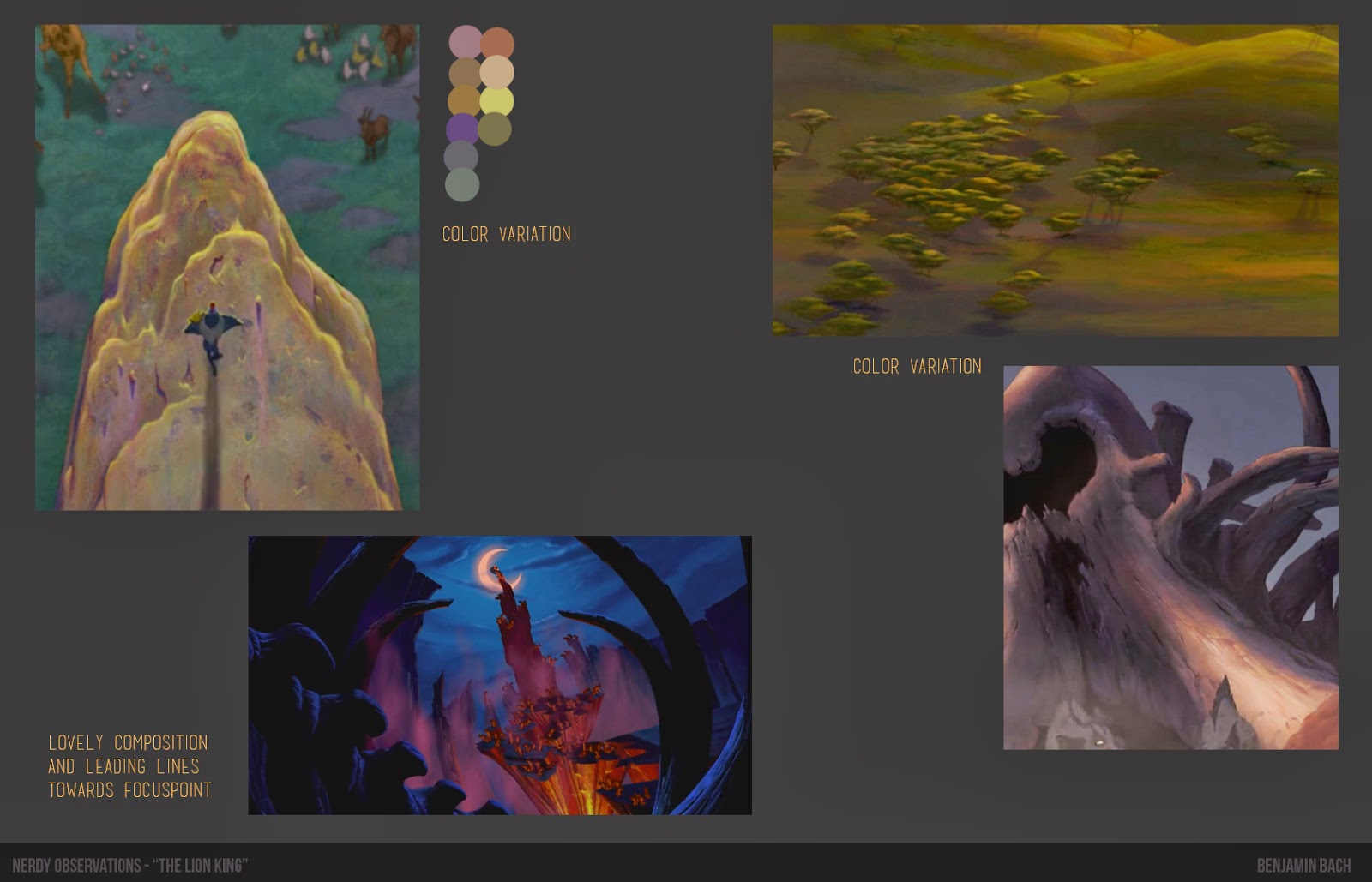
For a long time I've admired the background-paintings of "Bambi" and found them to have incredible draftmanship and delicacy. I've looked at them many times, but I haven't sat down and "really" looked at all of them, taken my time and figured out why they're working so well. First of all I want to mention that all of these background have incredible and solid layouts and valuestudies as seen here - so in my analysis I don't go too much into that aspect. The biggest realization for me personally during this analysis, was the way they make transitions: From dark on light, to light on dark, or from crisp->soft. In addition to this, paying attention to thin/fragile versus massive/thick. On a general note, I think what really works well in these backgrounds is just how controlled the edges is - soft, sharp, transitions - they all blend beautifully together.
/B


